
When I think about when my unnecessary and extra caloric intake happens, it generally tends to be during idle time. Infrequently it may be at lunch or dinner, but more often than not, it happens when in passing when I’m walking past the snack shelf at home, and also more often then not it happens when I don’t have planned activities. This, not surprisingly, is also when I’m watching TV.
In order to recognize this risk that idle time leads to watching TV which leads to snacks which leads to more calories which leads to unnecessary weight, I first needed to identify the times when I am most likely to have time for television or snacks. In order to do that I created the following weight loss risk heat map in excel by creating a daily timeline and identifying times I generally watched TV and snacked. 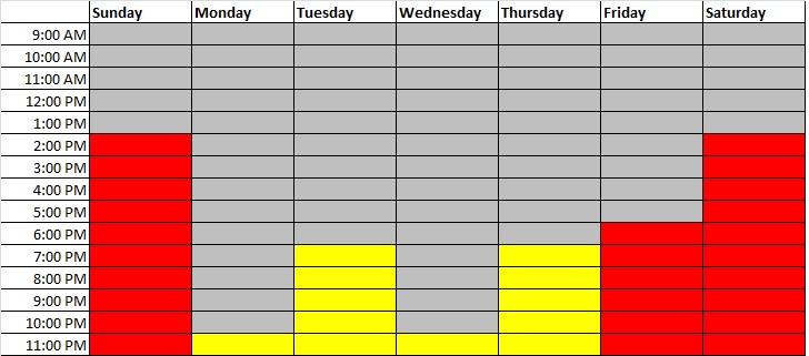
This heat map gives me a good picture of the days and times I’m at a high risk of indulging (in red) and also times where I am at a moderate risk (in yellow). Grey are minimal/no-risk times.
So what is the point of this heat map? Understanding the days and times of high risk is the first step in helping me manage them better. I’m planning on printing this out and posting on my refrigerator so that it is something I constantly see and am conscious of so I can make better decisions. I know these times I will need to either find other activities or food alternatives to keep the extra caloric consumption to a minimum. This will help me as I map out the food and activities for the week (in a future blog post).